How to make a website in 2025
A complete beginner’s guide
Creating a website might sound very complicated, but it doesn’t have to be. Today’s website builders make it very easy for you to create your own website.
You might have heard great things about WordPress, which is also a very good option. If you prefer to build your website with WordPress, go ahead and follow our guide on creating a WordPress website.
In this guide, we’ll focus on building a website with Website Builder. Website Builder makes it super easy for anyone to create a website. You won’t need any technical experience or coding skills, because you can simply drag and drop components to put your website together.
How to make a website in 7 steps
- Get the basic website needs
- Pick your website design path
- Design with AI
- Pick your favourite template
- Customise the design
- Create pages
- Add your unique content
- Preview and test your site
- Publish your website
1. Get the basic website needs
First things first. Before you can start building your website, you need a few things. Don’t worry, this doesn’t take long.
What do I need to create a website?
To make a website, you’ll need:
- Web hosting
- A domain name
- A website builder
Web hosting
The first thing you need is hosting. A website is basically a collection of many files. These files need to be stored somewhere. When someone is visiting your website, the browser can retrieve these files from the place where they are stored, a server. The browser is then able to display your website to the visitor. All of this happens in a split second. If you don’t have hosting, your files can’t be stored on a server and your website is not accessible. This is why you need hosting. You’re basically renting a space on the internet where your website files will be stored.
Domain name
You will also need a domain name. This is simply what a visitor types in the browser to reach your website. Our domain name is one.com. The domain name is basically the address of the space where your website files are stored. This is how domain names and web hosting work together, and why they are both required in order to create a website.
Website Builder
Finally, you need a tool to build your website with! Website Builder is a beginner-friendly tool that allows you to build a website with ease. Luckily, it is included for free in all our hosting plans, so you essentially only need to get two things.
If you select one of our Website Builder plans, you’ll automatically get the smallest hosting plan. You can also add a domain name in the checkout process. That way, you’ll have everything you need!
Selecting a hosting plan
At one.com, you can choose out of 5 different hosting plans. Which hosting plan is best for you depends on your needs. If you want to build a simple website, the cheapest plan is good enough. If you want to have more and better features, consider picking a higher plan.
Choosing a domain name
Once you have selected a hosting plan, you can add a domain name to it. The domain name is an important part of your website, so think carefully and register the right one. If you’re having a hard time finding the right domain name, check out our domain name tips.
What does it cost to create a website?
Very little! The cost of making a website depends on which hosting plan and domain you choose, but it doesn’t have to be more than the price of a cup of coffee per month. See our plans & pricing for the actual prices.
Can’t I make a website for free?
Sure, you could, but it’s not a very good choice. Creating a website for free comes with a lot of limitations. Most noticeably, advertisements will be placed on your website. You will also not have your own domain name, but have to use a subdomain of the hosting provider. That doesn’t look very professional, does it?
In order to get rid of these limitations, you’ll need to pay. You’re much better off with just paying a small fee for an actual hosting plan and a domain name at a provider like one.com, where you can create a website without those limitations.
If you’re not convinced yet, you can also try Website Builder for 14 days for free!
2. Pick your website design path
With Website Builder, you have multiple ways to start your dream website. It offers an AI-powered tool that generates a complete website draft for you near-instantly.
Alternatively, you can use one of its professionally designed and fully customisable templates to get started.
Use the AI website creation tool
You can choose AI onboarding for a speedy website creation experience. The process is designed to be intuitive and user-friendly. You simply need to answer a few basic questions about your preferences and business needs. The builder will ask for:
- Your website category
- Your business name
- Some “about us” information – you can be as detailed as you like
- Your contact information.
Once you’ve provided your input, the AI-driven tool takes over, instantly generating a custom design tailored to your specifications.
The tool selects layouts, images, and text that best fit the unique characteristics of your business or project. The AI intelligently curates content and visuals, making sure that each element is in line with your needs and results in a cohesive website.
If you’re satisfied with what you see, press ‘Apply’ when you’re prompted to.
If you want to see just how effortless website creation is with our AI onboarding tool, watch this short overview:
Pick a template
AI tools not for you? No problem at all! You can also select one of Website Builder’s professional customisable templates to get started.
To select a template, head over to your control panel and access Website Builder once you have completed your initial order.
Website Builder will then guide you through the process of creating your website. Similarly to the AI-powered onboarding, you start by filling in some general information about your website. This information will be used to make your website feel already yours after you pick a template. However, with a template, you can also skip these steps and add this information later.
Fill in the following information:
- The name of your business or project
- Your logo
- Your contact info
- A keyword to describe your website.
The keywords will help us in showing you the most relevant templates for your site because in the final step you’re going to choose your template. You’ll get to see templates that best suit your description. You can also go to an overview of all our templates and select one from there.
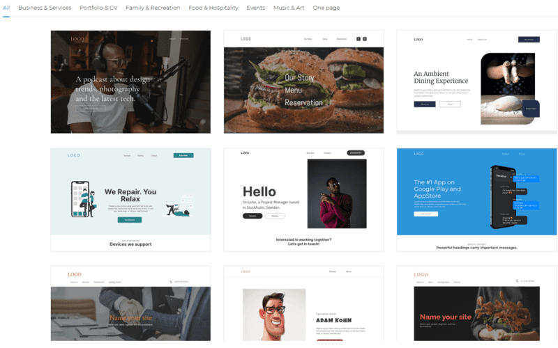
We have developed over 150 different templates, so you should be able to find the perfect one for your website. If you own a restaurant, go ahead and pick one of our restaurant templates. If you want to create a personal website, maybe you’ll like one from the Portfolio & CV category.
You can preview any template and even play around with the colour theme before settling on one. You can also always change your template later, if you aren’t happy with your choice.
Now that you’ve got either a complete website draft from our AI tool, or you have selected your template, it’s time to get ready for the next step and finally start building!
3. Customise the design
Here starts the fun part: actually building your website!
Although Website Builder is one of the easiest tools to create a website with, it’s still new and we understand if it’s a little overwhelming at first.
How does Website Builder work?
Let’s break down what you actually see on your screen right now and how Website Builder works.
If you select to take the tour, Website Builder will show you around and explain it all. Missed the tour when you first launched Website Builder? You can always find the tour again in the top bar.
Your website consists of individual components. You can click on them to edit, resize or drag them to a different position. It will be highlighted if components overlap each other, but you can choose to ignore that. These components can be placed into sections. A section is basically a part of your page. This will help you in creating a good page structure. One page can have multiple sections, and a section can have multiple components.
On the left side, there is a sidebar with different components. Simply click on one and drag your desired component into your website. We’ll deep dive into these specific components a bit later, but it should be pretty self-explanatory. Sections can be added by clicking the orange plus icon.
In the top bar, you can also find several useful features when you’re making your website. Let’s go over them.
Page overview
In the first dropdown, you can find an overview of your pages. You can manage, add and delete pages here. You can also access individual page settings here. We’ll talk more about that later.
Help
Next to that, you can find a button to get help. Here you can find quick tours that show you how Website Builder works, keyboard shortcuts and a link to our help guides. In these guides, you can also find a lot of information about creating a website.
Backup
With the arrows, you can undo or redo your latest actions. Next to that is an icon for backups. With this feature, you will be able to restore previous versions of your website. This is useful if you made a lot of changes, but aren’t happy with the result.
Desktop and mobile editor
You can also switch between the desktop and mobile editor in the top bar. When you start, you are editing the desktop version of your website. But of course, it’s also important that your website looks great on mobile devices. That’s why you can also use the mobile editor. Switch between the desktop and mobile editor to make sure your website is responsive and looks awesome on all devices.
Save
With the save button, you can save your progress, so it doesn’t get lost.
Preview
With the preview button, you can see what your site will look like once you publish it. It’s recommended to check this regularly to make sure the changes to your design work well. You can both preview your website on desktop and mobile, and can do so at any time.
Publish
Once you’re done with creating your website, all there is left to do is to publish it. You can do that with this button. After you publish it, your site is ready and accessible.
Settings
On the right side of the top bar, you can find a dropdown menu and access settings. Here you can modify the settings of your website, such as the website title, your logo, a favicon and other general information.
You can also enable a cookie banner here. Having a cookie banner is important if you want to collect user data. If you picked the Business + Ecommerce plan, you can set up integrations with Google Analytics, Google My Business and Meta Pixel (previously known as Facebook Pixel).
How do I customise my template?
Whether you have selected a template or used AI to create your site, the way your site looks in this first stage isn’t necessarily how it will end up looking. This is just a starting point. Of course, you could keep your site like this if you’re happy with it, but it’s actually very easy to customise further and develop a unique design yourself.
Changing the colour theme
The colour theme decides the overall styling and colour usage of your website. It makes sure your website is consistent in the use of colours and will improve the user experience. All components will be styled according to your colour theme. Therefore, it saves you a lot of work because you won’t have to manually style every component of your website.
Maybe you’ll want to have a different colour palette than your current design has. For example, something that matches your logo or business colours. It’s very easy to change this. Just select one of our premade colour themes, or create your own, and your site’s design will be updated instantly. Our designers have preselected many colour themes for you, in different styles.
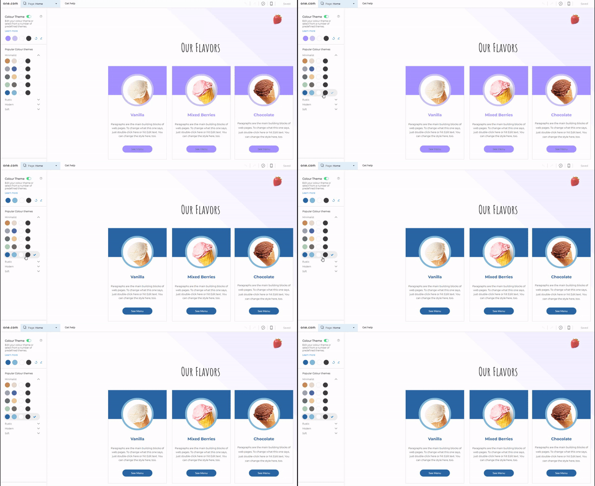
You can change your colour theme by going to the little icon in the bottom right corner. If you do not want to use a colour theme, you can simply disable it.
Styles
In Styles, you can do much more than setting the colour theme of your website. This is where you can change your fonts and text styling, as well as styling for other components. Any changes made here will be reflected across your entire website.
Text styling
Here you can set the font, font size and more for paragraphs and headings. On the right side, you can see a preview. You can also add additional Google Fonts here.
Link styling
This defines what links will look like. The styling is based on the colour theme you have selected.
Menu styling
In this tab, you can style your menu. There are plenty of things to customise here, so you’ll be able to create your own unique menu.
Button styling
The button styling is again based on the colour theme you’ve chosen. However, you can make additional customisations, such as the corner styling. You can, for example, have rounded or squared corners, or a combination of both.
Table styling
If you want to add tables to your website, this is where you can style them.
Template settings
If you’re using a template, you can edit the background styling and scroll effects using template settings. If you would like to have a different template for a specific page, Template Settings is also where you can set this.
What is important for a good website design?
Having a good website design is crucial because it impacts how your brand is perceived by visitors. The first impression someone has of your site will decide if they will stay on the site and learn more about it, or if they leave it and go to a competitor’s site. Eventually, a great website design can lead to a better brand perception, and more leads or conversions.
There are many factors that help determine the quality of your website’s design. But in general, these are some principles every good website design should have:
- A responsive design, that looks great on any device
- Consistent use of colours and other styling
- A clean page layout
- User-friendly site navigation
- Informative and engaging content
- Buttons and CTAs to drive conversions
Most of these principles are already covered by both our AI tool and our templates, as the former is created with design principles in mind and the latter are developed by professional designers. But if you decide to make significant changes to your design, or create your website from a blank template, keep these tips in mind.
How do I create a website menu?
The menu is an important part of your website. It should be made easy for users to navigate to different pages. A poorly designed and structured menu can confuse and frustrate users, and that’s not what you want! Having a good menu is crucial for a good user experience.
Luckily, whether you choose AI onboarding or one of our templates, both already come with a good menu. If you’re satisfied with what you see, you don’t need to touch the menu at all. Any new page you create will be automatically added to the menu. You can also exclude pages from the menu by going to the settings of a page.
The menu is placed in the header, so website users have easy access to it. It’s a reusable component, which means it will be present on all pages. And any changes you make to the menu will be reflected on all pages.
The mobile menu usually looks a little different, because there is simply not enough space on mobile devices to properly show the same menu. In most cases, the mobile menu will be an icon, often called a hamburger menu. You can recognise this by the 3 vertical lines. In this way, the menu doesn’t obstruct the view of your website. Users can access the menu by clicking the icon.
The header & footer
The header and footer are crucial sections of your website. Both the header and footer are reused across the entire website. All the changes you make to the header or footer, will be reflected on every page.
The header is at the top of every page, and usually contains your website’s logo and the menu. It’s the first thing a user sees when they enter your website and plays a role in the first impression a user gets of your site.
The footer appears at the bottom of every page and typically contains contact information, social media icons and useful links that are not part of the menu. Since the footer is the last part of a page, it is also an important section. It might be your website’s last chance to get the user’s attention before they exit your site.
How do I customise the header and footer?
Both sections are completely customisable. It works similarly to customising other sections on the page. You can add, remove, resize and move around components in the header and footer. But we recommend keeping it simple and clean. The header and footer are not the right place to add page-specific content and should not be cluttered.
How do I add a favicon?
A favicon is a small icon that appears in your browser tab, next to the title of the website. On our site, you can see a small green dot in the browser tab. This is our favicon. A favicon is usually a small version of your logo. Users will remember and associate your favicon with your website. If a user has multiple tabs open, it will be easier for them to find your website.
We recommend adding a favicon since your website looks less professional without one. You can add one by going to the settings of your website in the top bar.
4. Create pages
In this part, we’ll explain the creation of pages. Most website designs already start with a set of basic pages. These are pages that you’ll see on most websites like a homepage, an about us page and a contact page. You can modify these pages to your liking. You can also delete these pages if you don’t need them.
How do I create a new page?
In the top bar, you can manage your pages. Here you can add, delete or duplicate pages. To add a page, simply click the blue button. You can start with a blank page, or take one of our premade templates. These templates might not initially look like they fit in your design, but they will take whatever styling you have on your existing pages, so they’ll fit in perfectly!
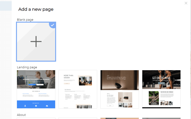
You can also duplicate an existing page if you want to have a new page with a similar layout, and start creating the page from there.
Creating a layout with sections
Sections are used to structure a page. The header and footer are sections, but in between, you will have sections that belong to this specific page. It’s a good practice to have a different section for every topic you want to show on this page.
For example, on your homepage, you would like to communicate four different things to the user:
- An introduction to your company
- Your most important service
- The rest of your services
- Customer reviews
You can turn each of these things into a separate section. This allows you to work in a structured way and helps the layout of your website.
A section can be added by clicking the orange plus sign between different sections. This will add a blank section to your page. However, you can also add premade sections from the components sidebar on the left. These sections will again be styled according to your colour theme, so they’ll fit in your design.
Sections offer you a lot of flexibility. You can edit, resize, duplicate them, and change their order.
Having sections is useful because you can move around multiple components at once, without them losing their positions.
Inside the sections, you will place components such as text or images.
Working with components
You will most likely want to change the layout and content of your newly created pages. That’s where components come in. In the sidebar, you can see all the components you can use on your website. Most of these components come with premade versions that you can use in your design.
To add a component, simply drag it from the sidebar and drop it in your design!
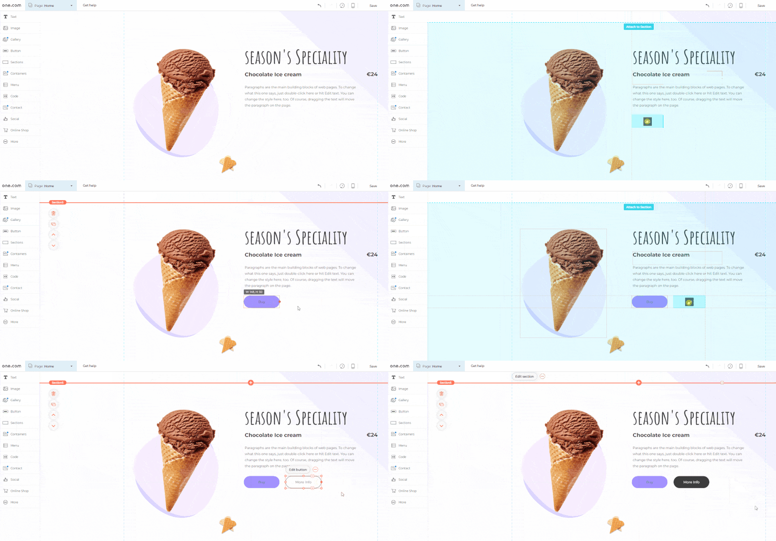
Which components can I use?
In Website Builder, you’ll have many components you can use on your website.
Text
Text components are something you will use a lot. From headings and paragraphs, to lists and text and image combinations. There are a lot of premade text components. All these will be styled according to the text style settings of your template.
Image
Allows you to add images to your website. Upload your own images, or choose images from our database or Unsplash.
Gallery
With the gallery component, you can add galleries and sliders with images to your page.
Buttons
Buttons can be used as call-to-actions, and they allow users to interact with your website. It encourages users to do something on your website, such as buying a product.
Sections
Even though you will place most components inside a section, it is also a component on its own. Here you’ll find many premade sections, with components such as texts, images and buttons already inside.
Containers
Containers can be used to contain something, usually in the form of a box or a strip. It can be useful if you want to show a few products or services next to each other, for example.
Menu
The menu is something we already discussed earlier. It should normally be placed in the header.
Code
If you want to add your own piece of code to your website, this component can be used. It’s not recommended for novice users.
Contact
Here you can find components for your contact details. As well as a contact form, so your customers can easily reach you!
Social
Add social media icons to your website, so customers can find your social media. You can also add a widget of your Facebook page, or even an Instagram feed if you have Website Builder Premium.
Online Shop
If you have created an online shop with us, you can add product components to your website.
More
Here you can find a few additional components, such as documents, videos and tables.
Page settings
In the page dropdown, you can go to page settings. Here you can change individual settings per page. You should go over these settings for each page of your website, to make sure they’re set right.
Page names
Here you can define what the name of this page is in the menu. The URL can also be customised here if you’d like.
SEO
You can set your page title here, which will be shown in the browser tab and in search results. The meta description gives users a brief description when they encounter your page in a search engine like Google. On the right side, you can see a preview of how your site will appear in search engines.
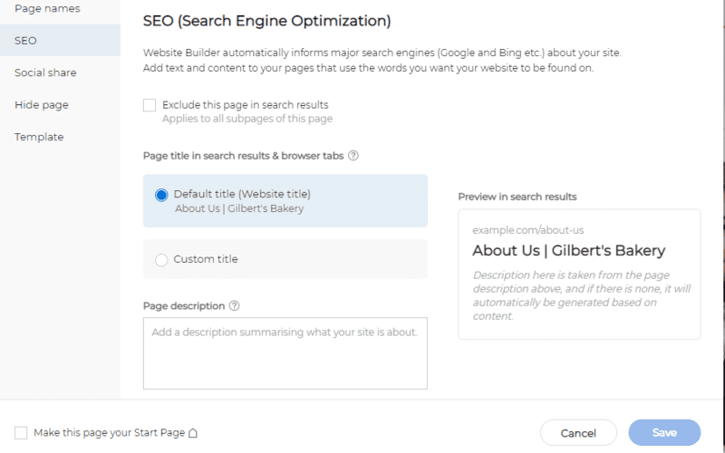
Setting a good page title and meta description is an important part of SEO. It will help in getting your website a good ranking in Google and other search engines, so your website can be found easier by potential visitors.
If you don’t want this page to appear in search engines, you can exclude this page in search results.
Social share
In this step, you can decide how a page looks on social media when someone shares the link. This is yet another important step, because it might attract new users to your website. Add a good image and title to make it stand out on social media timelines.
Hide page
If you want to exclude a page from your website’s menu, you can do that here. Or you can hide the page altogether by not publishing it. This can be useful if you want to publish your website without this specific page. Because you’re still working on it, for example.
Template
Here, you can change the template for this page if you would like to use a different template for this specific page. You can also change the template styles and settings, but note that this will change the styles or settings of all pages that use this template.
What kind of pages should I create?
This is completely up to you and depends on the purpose of your website. Most templates give you a good starting point by having a homepage, an about us page and a contact page. These are pages that would exist on most websites.
If you sell products or services, it makes sense to create pages for those products or services. Maybe you’ll even want to create some more in-depth pages that highlight specific features of a product or service.
In order to sell products on your website, you might want to upgrade to our Business + Ecommerce plan. Turn your website into an online shop!
Create your online shop
Start your e-commerce business quickly and easily. And sell your products or services online.
Get started- Easy product and sales management
- Secure payment methods
- Online in a few steps
- Free SSL certificate
- Mobile friendly
- 24/7 support
You could also create an FAQ page, if you want to give your customers’ more information. Or a review page that shows testimonials about your company. A good practice would be to look at websites that are similar to yours, and see what kind of pages they have.
You don’t want to clutter your website with a lot of unnecessary pages. Just keep it simple. It’s perfectly fine to have a website with only a few pages. Having a homepage, a product page, an about us page and a contact page is usually enough for most small business websites.
How do I create a good homepage?
The homepage is arguably the most important page of your website. Most visitors will land on your homepage, so it’s important that it catches the visitors’ attention.
So, how do you design a good homepage? Again, this depends on the purpose of your website. But here are some tips for you on what we believe would make a good homepage.
First of all, it’s the perfect place to introduce your website. A visitor who has never been on your site before wants to know what your site is about, so that should be clear right on the homepage. Who are you, and what do you do? Those are questions a visitor might have.
You can use ‘call to actions’ in the form of buttons on your homepage if you want visitors to perform a specific action, like buying a product or signing up for your newsletter.
Of course, you should also make sure your homepage is easy to understand and has a user-friendly design. You want to impress your visitors, and not confuse them.
Other than that, it really depends on what kind of website you’re making. On a personal website, you might want a picture of yourself and links to your resume or recent projects on your homepage. If you sell products, you might want to highlight the most important products on your homepage.
If you’re struggling to make a good homepage design, go visit some of your favourite websites. You can take a lot of inspiration from them!
Most of these suggestions involve adding your own content, which is the next step in creating a website.
5. Add your unique content
You should now have the design and layout of most pages ready. All there is left to do is fill it in with content. Website content includes, for example, text, image or video elements on your website. It is probably the most important part of your website, because it tells visitors what your site is about.
Content is much more than writing a bunch of text. It determines how you communicate to your visitors. The quality of your content can make a huge difference in how visitors perceive your website, and if they become a customer or not.
How do I write good website content?
Text refers to all written content and will be the majority of your content. It should be easy to read and engage customers.
A good starting point is to write clear headings and short paragraphs. Longer paragraphs are generally harder to digest. Write content that is to the point and grabs and keeps the readers’ attention.
Another essential part of writing good website content is SEO. If you want your pages to rank well in search engines, your content needs to be optimised for the queries that people search for. These queries are called keywords and using them in your content will help the page rank better. You should enrich your content with keywords in a natural way, without reducing the readability. Spamming your text with keywords will likely have a negative effect.
It’s also good to have a set tone of voice. This helps you be consistent in how you communicate to customers. A good tip is to use the tone of voice on your website across all your communication with your customers, such as via email and social media.
Writing quality content is not easy and takes time. That’s why we have also implemented an AI writing tool into our Website Builder! Similarly to the AI onboarding, the AI writing tool prompts you to answer a few questions and then produces relevant, well-written content. Just like the AI-created website, you can then customise and modify the text it produces to fit your needs.
To get more tips on writing good website texts, read our guide on content writing.
How do I add images?
With images, you can make your website visually more appealing. In Website Builder, you can easily upload your own images, choose stock images from our database, or get them directly from Unsplash.
Where can I find stock images?
You will have access to thousands of free images and illustrations in Website Builder. These are sorted by category and discoverable via a search bar, making it easy for you to find suitable images for your website.
6. Preview and test your website
Now you’ve picked a template, customised the design and added your own content. So you’re pretty much done with creating your own website. The final step before publishing is to preview and test your website. You want to make sure your website looks and works the way you want it to.
Preview your website on both mobile and desktop, and ask yourself the following questions:
- Are you happy with the design?
- Is the use of colour, fonts and other styling consistent?
- Is the content informative and engaging?
- Are there no grammar or spelling mistakes?
- Are all buttons and links working?
Also check out our complete checklist before launching a website, to make sure you didn’t forget anything!
7. Publish your website
Everything done? Then it’s time to publish your website! Click on ‘Publish’ and your site will be live for everyone to see.
Of course, you can always come back to Website Builder to make changes and create new pages. Just remember to publish your changes again for them to go live.
Congratulations, you’ve just built your own website!

